(DISPLAY BOARD PIECE - BOARD 8 OF 8)
Whilst I very much enjoyed my initial and subsequent pieces for Project 10, I was still concerned that I had not fully addressed the issue raised by the tutor about my working not being sufficiently stretching and the observation in particular that my earlier silk pieces were freer and more imaginative.
The original silk painted pieces.
So I have been back to the drawing board as it were, spread out all my pieces and really evaluated them for "spark" and creativity.
Each time I looked, my eye was drawn back to the print pieces I completed for Assignment Two - in particular these two pieces from Parts
One and
Two (
Note: both of which can be found on assessment display board Two).
I can see an interaction between the freedom of expression in the silk painting pieces above with the print pieces. Perhaps it is the fact that these pieces were produced at an early, very experimental stage of the course that they are freer and more expressive. Again, in Project 10, the silk samples were part of the development process and so I was more focussed on the experimentation and less so on the finished piece. It is interesting to note also, that the tutor for Assignment Two (a different tutor to Assignment 5) highlighted that these pieces were more successful than my final print which she described as "technically superior" to these prints but preferred these prints for the relationship between the fabric and the prints and the greater freedom of expression.
Final print sample.

With this in mind, I went back to my sketchbooks to experiment,
focussing on the experimentation process rather than on a technically
well executed but less lively design.
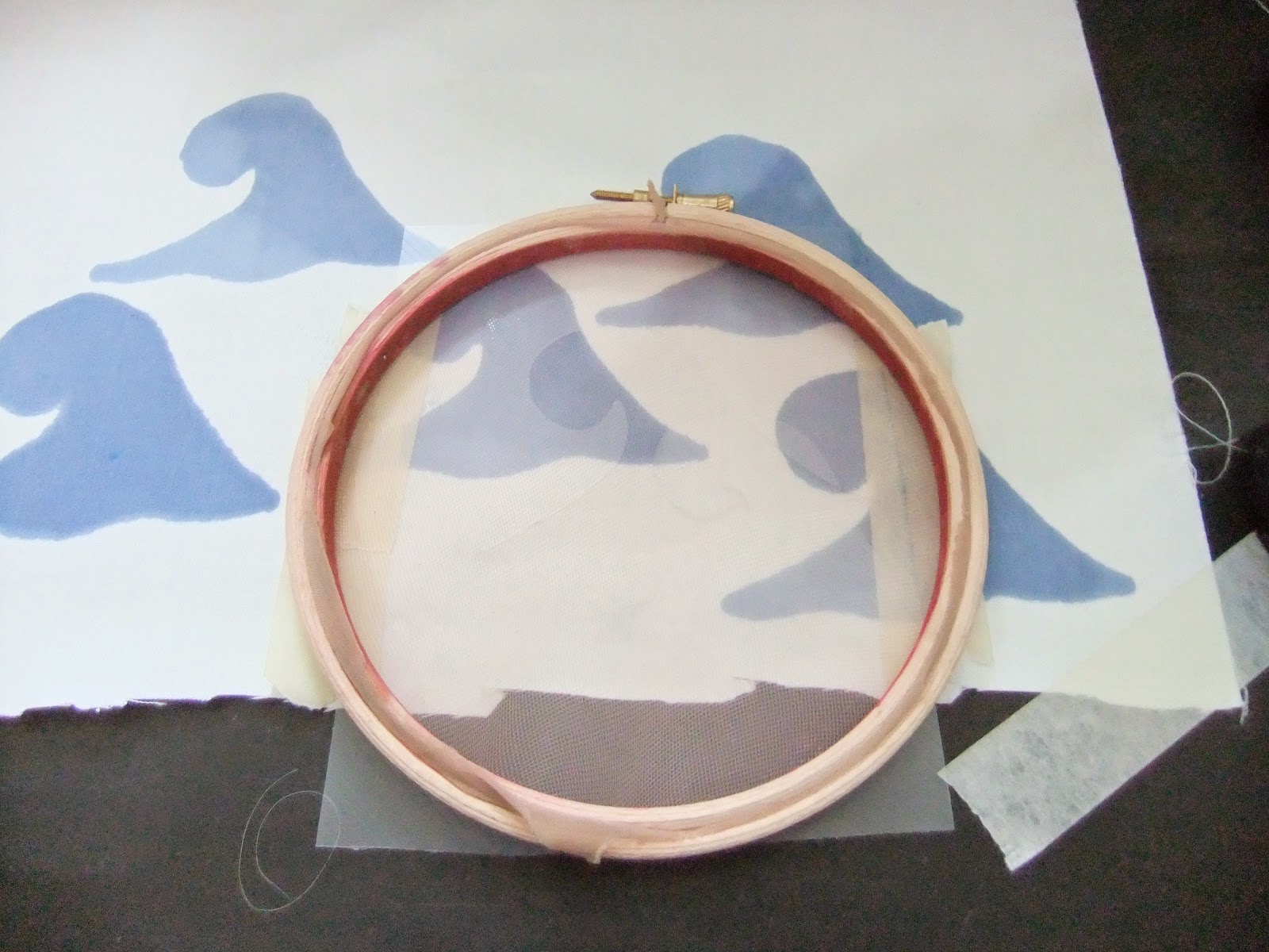
Continuing with the broad wave image, I created a stencil using a
piece of acetate from and old document wallet. I chose a scale that
would be dramatic enough to be striking and bold but not so large it
would look out of keeping with the overall size of the piece.
I used acrylics to screenprint onto paper.
From there I mixed up procion mx dyes and used the stencil to screenprint onto fabric.

I worked with both overlapping and discrete prints, single colour dyes and mixtures made by dropping different colours onto the screen.
Outcome and thoughts
The single colour prints on the plain background were dull and uninspiring. Adding the extra colours improved the liveliness but still wasn't hugely inspiring. However, it was useful to be able to dry the prints between layers and get good overprints (see the issue bleach overprints below). The acetate worked well but the dyes may not have been thick enough and/or my technique needed more practice as there was some bleeding. I concluded that more experimentation was needed.
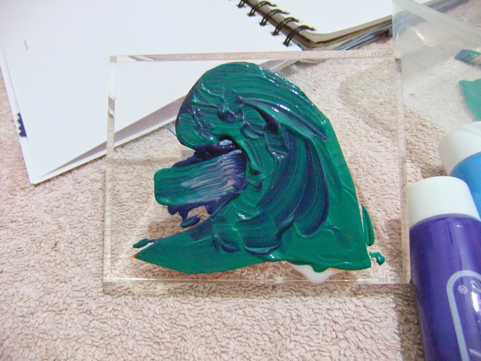
I observed when I removed the stencil and started to wash it that there was a lot of dye left over on the stencil so I did a quick negative print to see how the acetate would interact with the ink (onto paper rather than fabric).
The print left much to be desired but I did like the qualities of the swirling produced by the dyes where they squidged under the acetate.
So I retried this with acrylics, initially onto paper.
This was a lot of fun - texture, great interplay of colours and unique results with each print. I moved onto fabric, again trying no water and additions of water.
Acetates:
On the fabric:
I was having a lot of interesting results with this technique but wasn't happy with the plain background so I scrunch-dyed some of the plain cotton with procion mx dyes:
I added print binder to the acrylics and printed a layer of the acetate "waves" along the bottom of the fabric.
Outcome and thoughts
More by good luck than good management the tie-dye had created a sunburst from behind the clouds with an ocean below. I had planned to overprint more layers of the acetate but really like this so left it.
Having looked at the fabric and the acrylic prints I didn't feel that multiple layers of the print would work, rather it had the potential just to be too intense and "busy" but it was rather kitsch for my design to use what had turned out to be effectively an abstract seascape. I also couldn't envisage two matching sides of this design.
The stencil wave wasn't suitable for adding to the acetate print so I used a piece of play foam to create a block print.

I painted the block print with acrylics and binder.
Then I printed this onto the "ocean" to add extra interest and to give the image more structure but without repetition. Again, this image was lively and the colours were great but it looked too pictorial.
I tried a repeat pattern print. The "sea in sea" effect was quite dramatic but I was still looking for something less rigid and structured.
At this stage I still didn't like the plain background and I loved the tie-dye effect so I dyed more test-pieces.
I'd done some lemon juice and bleach discharge printing on the samples. The lemon juice wasn't hugely successful and was on natural dyes which are easier to discharge so I tried bleach. Again, I used the block print and applied the prints at random, overlapping some and leaving others in a random arrangement with gaps in between.
I was really pleased with the results. The bleach was too strong in parts where the overlaps were and the colour completely disappeared but it was very interesting to see how the bleach had taken out different parts of the make-up of the dye (some dyes being a mix of colours not a pure dye). Where the bleach had dripped it gave the effect of flecks of seafoam which I felt added to the liveliness and vibrancy of the design.
I did a final sample using a larger piece of fabric, roughly cut into the waistcoat front shape for placing of the prints and used the same technique. I dyed the fabric nice and dark to maximise the impact of the bleaching and give the piece a rich intensity.
I finished the piece by printing with the bleach, mostly keeping the motifs separate but with some overlapping to create a more naturalistic feel.
Outcome and thoughts
I enjoyed this piece and found the less rigid approach very liberating. It was unfortunate that I did not have time to complete the piece, however, I think it will work well. It is a long way from my original intention of a classical-styled waistcoat but satisfying nonetheless.
I can see potential for further development of this idea. I may go back to the samples and cut these to create layers then apply the layers to a base fabric, most likely scrunch-dyed but possibly with some bleach prints.
There are opportunities for combining the acrylic prints with the bleach print and it would be interesting to see if a 3-d fabric medium could be used (sparingly) to add a three-dimensional quality to the print. This could give exciting depth and texture.
Stitching into the piece much as I did with the original sample would add an extra dimension and would be worth testing. I would do this as a random stitch effect rather than rigidly outlining each wave.